ShopDreamUp AI ArtDreamUp
Deviation Actions


Description
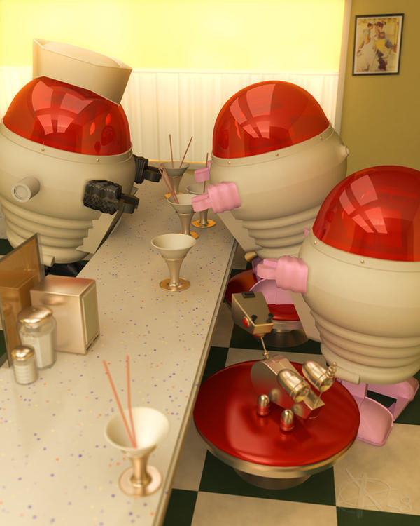
More little bots. This one is for the monthly theme contest at  run by
This months theme is 'Robot Soda'. I took inspiration from a Norman Rockwell illustration [link] , which I included in my version as a picture on the wall.
I had a lot of fun on this one, am pretty happy with how it came out, and I even found a use for [link] , though I made some obvious shader changes.
Hope you enjoy it.
-p
run by This months theme is 'Robot Soda'. I took inspiration from a Norman Rockwell illustration [link] , which I included in my version as a picture on the wall.
![[link]](https://www.deviantart.com/users/outgoing?http://www.normanrockwellvt.com/big.jpg/Soda_Fountain.jpg)
I had a lot of fun on this one, am pretty happy with how it came out, and I even found a use for [link] , though I made some obvious shader changes.
Hope you enjoy it.
-p
Image size
2400x3000px 2.67 MB
© 2009 - 2024 Ammut88
Comments25
Join the community to add your comment. Already a deviant? Log In
Composition:
Exquisite. The red domes/seat lead the eye around nicely. The diagonal lines in the counter also lead the eye into the image. The horizontal edge on the back wall keeps us there. Absolutely wonderful.
Shading:
Really amazing. The plastic domes, counter, chrome, glass and ESPECIALLY that glossy seat are just superb. I think the sampling on your blurry materials (ie the napkin dispenser) could probably be slightly increased to decrease the noise. But that is also potentially a style decision. <img src="e.deviantart.net/emoticons/s/s…" width="15" height="15" alt="
Lighting:
REALLY nice. The diffuse quality still creates nice grounding shadows, but also brings a calm warmth into the scene that makes for a really great feeling in the image. The HDR (or what looks like HDR) reflections on the characters really sell it as being so much more realistic. I can't tell if it is just an aspect of your shaders, but there is a slight speckling on the lower torsos of the customer robots (and not on the waiter, which is why I would assume it isn't a shading thing) that is probably an issue related to whatever flavor of GI you are using. Either increasing ray/photon counts and/or their aggregate interpolation values might smooth that out.
Modeling:
I've always loved those 'bots. They are extremely well made. I am a particularly big fan of the way the head domes appear to mount into the body pieces. The multiple bevels on the edge of the counter is also a very nice touch. The geo on the near soda glass as well as the metal base directly underneath the red seat cushion is probably a little light, as you can see some faceting.
Misc:
It looks like you might have used a true DOF (as in a lens based DOF in your rendering app), which likely took a nightmare quantity of time to render. For straight realism it can't be beat, IF you crank the associated sampling through the roof. Although, again, it might be a style issue, it looks like it is creating a small amount of noise on the near soda glass. It might be worth rendering a depth pass and using it via 'Shop to create a fake DOF using the lens blur filter. Although not truly accurate, it is convincing, and provides the flexibility of being able to adjust the levels/curves of your depth pass to tweak your DOF to your ultimate whim.
Final thoughts:
Absolutely spectacular work man! Superbly well done, and spot on (IMHO) for the contest theme. I think this is my favorite piece of all your DA work.
Good luck with the contest!